One of the most frequent questions we receive about the Atlanta Fed's Wage Growth Tracker (the median of year-over-year percent changes in individuals' hourly wage) is about the relationship between wage level and wage growth. For example, do high-wage earners also tend to experience greater wage growth?
An earlier macroblog post explored this question. Unfortunately, answering it is not as easy as it might appear. When looking at wage growth by wage level, whether you use the prior or current wage level as the reference point matters—a lot. If we looked at wage growth categorized by the prior year's wages, we would find higher median wage growth for low-wage earners than for high-wage earners. This is because some workers who earned low wages last year earn middle or high wages this year, and some of last year's high-wage workers earn middle or low wages this year. If we instead categorized people based on current-year wages, we would see exactly the opposite: lower median wage growth for low-wage workers than for high-wage workers.
One way to lessen this wage-level base effect is to categorize an individual's wage growth according to their average wage across the two years. The following chart shows this categorization for the 2016 to 2017 wage growth distribution of all workers in the Wage Growth Tracker data. In the chart, the first quartile (labeled <$13.8) depicts the lowest-paid 25 percent of workers based on their average 2016–17 hourly wage, and so on. The center line of the box for each quartile is the median of that group's wage growth distribution, and the lower and upper boundaries of the box are the 25th and 75th percentiles, respectively. The outer lines are the thresholds for outlier observations (see here for the calculation.)
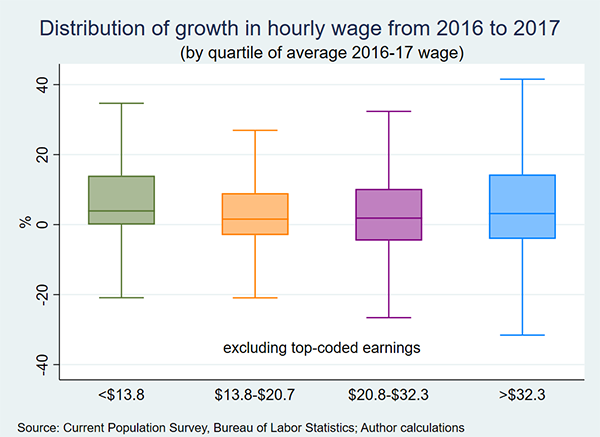
The chart shows that the wage growth distribution across the average-wage quartiles does, in fact, differ. For example, the median wage growth from 2016 to 2017 for the lowest quartile is 3.9 percent, 1.6 percent for the second quartile, 1.9 percent for the third quartile, and 3.2 percent for the top quartile.
The pattern of higher median wage growth in the lower and upper quartiles, compared with the middle part of the wage distribution, is reasonably uniform over time. However, there is a cyclical difference between the median wage growth of high- and low-wage earners. This difference is apparent in the following chart, which plots median wage growth over time for each average-wage quartile.
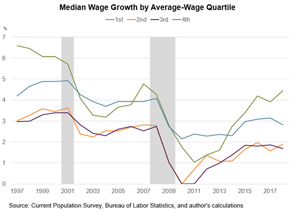
As the chart shows, median wage growth of low-wage workers (the green line, first quartile) currently exceeds that of high-wage workers (the blue line, fourth quartile), but it was below the median for high-wage workers in the wake of the Great Recession. This pattern is consistent with the both the severity of the recession and what we have been hearing more recently about emerging shortages of low-skilled workers. In contrast, median wage growth for workers in the middle of the wage distribution (the orange and purple lines) remains lower than for either high- or low-wage workers. Overall, these findings reinforce the idea of polarization, where the demand for workers has generally grown more in the tails of the skill/wage distribution than in the middle.
 By John Robertson, a senior policy adviser in the Atlanta Fed's research department